Binx Le Fae

Year
'23
Client
Binx Le Fae
Service
Brand Identity
Binx Le Fae is a Los Angeles–based music producer known for her crafting earthy, ethereal soundscapes that enchant listeners with soulful & emotional depth.
© Binx Le Fae


Overview
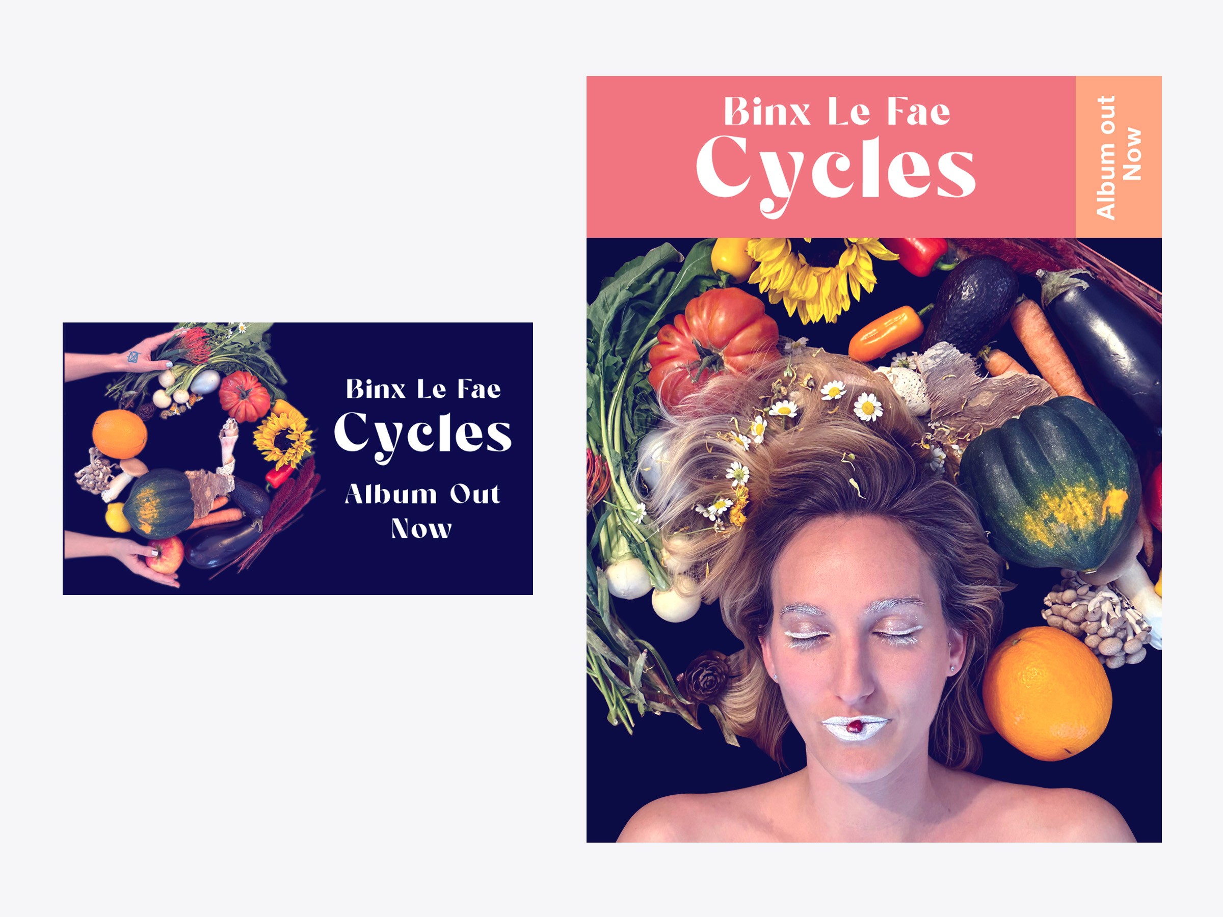
This visual identity for Binx Le Fae's third album, Cycles, the final chapter in a trilogy exploring the dimensions of human experience. Was inspired by the recurring patterns of nature, time, sound, and transformation, the identity translates the album's themes of renewal, repetition, and personal growth into a cohesive visual system. The branding was designed to establish a distinctive presence across album artwork, streaming platforms, social media, and promotional materials while reinforcing the album's narrative of returning, renewing, and beginning again.
Research
Through collaborative workshops and mood boards, we identified themes of renewal, circular movement, and nature that became the foundation of the identity. Drawing on Binx Le Fae's interest in paganism, I looked to Swedish Midsummer traditions for inspiration, using the cycle of sowing, growth, and harvest as a visual metaphor for the album.
The color palette was inspired by ripe fruits and vegetables from the photo session, creating warm, natural tones reminiscent of Midsummer celebrations. To complement this organic aesthetic, I selected the typeface Sugar Magic, whose 1960s-inspired forms echo the Art Nouveau movement and its connection to nature.
Process
Once the core visual elements were established, I explored a series of visual motifs informed by the album's themes and supporting research. Through iterative testing, I developed a warm color palette inspired by the accompanying photo session, which featured mushrooms, fruits, and vegetables harvested from the artist's garden. Arranged in a circular composition, these organic elements became a visual metaphor for the album's title, Cycles, reinforcing themes of renewal, interconnectedness, and return. This approach established a cohesive visual identity and distinctive aesthetic that carried consistently across the project.
Challenges
Create a visual identity that communicates the album's themes of renewal, transformation, and cyclical movement through a cohesive design system. The identity needed to balance symbolism with clarity while remaining flexible across album artwork, streaming platforms, social media, motion, and promotional materials.
Result
The final identity for Cycles established a cohesive and flexible brand system that translated the album’s themes of renewal, transformation, and cyclical movement into a clear visual language. The system was applied consistently across album artwork, streaming platforms, social media, motion, and promotional materials, creating a unified presence throughout the release.
MacBook Air
Unbind